This article presents the best practices for setting up screens and frames from Elipse E3 that use different display aspect ratios (screen resolutions and proportions).
Why this configuration matters
When setting up screens with different display aspect ratios in a SCADA sysem, it’s important that we consider their readability in the system overall.
Be sure not to mistake readability for clearness, because these two concepts share many similarities. So, we will first present the definitions for both ideas in the sections below.
Clearness
In user interfaces, we say that any piece of information that users can easily communicate or understand is clear information. On the other hand, unclear information is ambiguous, may cause confusion, and is not straightforward to communicate its meaning or function.
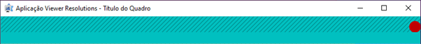
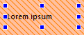
For example, imagine that you want to execute a command to open a valve, and the application presents you the following button:
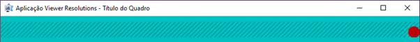
Then, you click “Open” and the following window pops up, with new options for operating the valve:
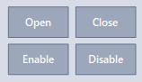
In this case, the word “Open” was a reference to opening the window itself, and not to commanding the valve. Its original meaning is ambiguous and unclear about the expected result. Therefore, we can say the information in the button was not clear enough.
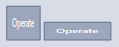
One way of expressing the same information, but in a clearer way, is to change the word in the button from “Open” to “Operate”:
That is, the concept of clearness is related to direct communication, where the intended meaning of the object being represented is unmissable and raises no questions. On its turn, it will depend directly of the text’s or object’s readability.
Readability
The concept of readability pertains to how easily a reader can understand written text. Readable information can be detected with no difficulties by our brains. On the other hand, lack of readability requires more cognitive effort from the user in order to perceive it correctly, which may render direct communication of concepts more difficult, or even impossible.
Several factors can interfere with an object’s readability. For example, a text may not be very readable if the font color has little contrast with background color:
Another fact that can compromise a text’s readability is using a too-elaborate font:
Distorted, disproportional fonts can also be hard to read:
Small-sized fonts are challenging to some readers:
Symbols and icons can have readability issues too. For example, a user may not readily notice distorted icons:

The same thing applies to smaller icons:
Security
The interface’s readability is a major security concern in industrial and critical systems because it ensures users can gauge correctly both the meaning of the symbols and their functions.
Scenarios that have different display resolutions and aspect ratios are bound to suffer from readability issues. Therefore, it’s important to design an efficient visualization strategy that uses the best types of zoom for each case. The goal here is to virtually eliminate any legibility losses that may occur when adjusting visualization.
Template with Aspect Ratio and Resolutions
It’s essential that you use a template with display aspect ratios and resolutions in order to be able to visualize and adjust the screens for each scenario.
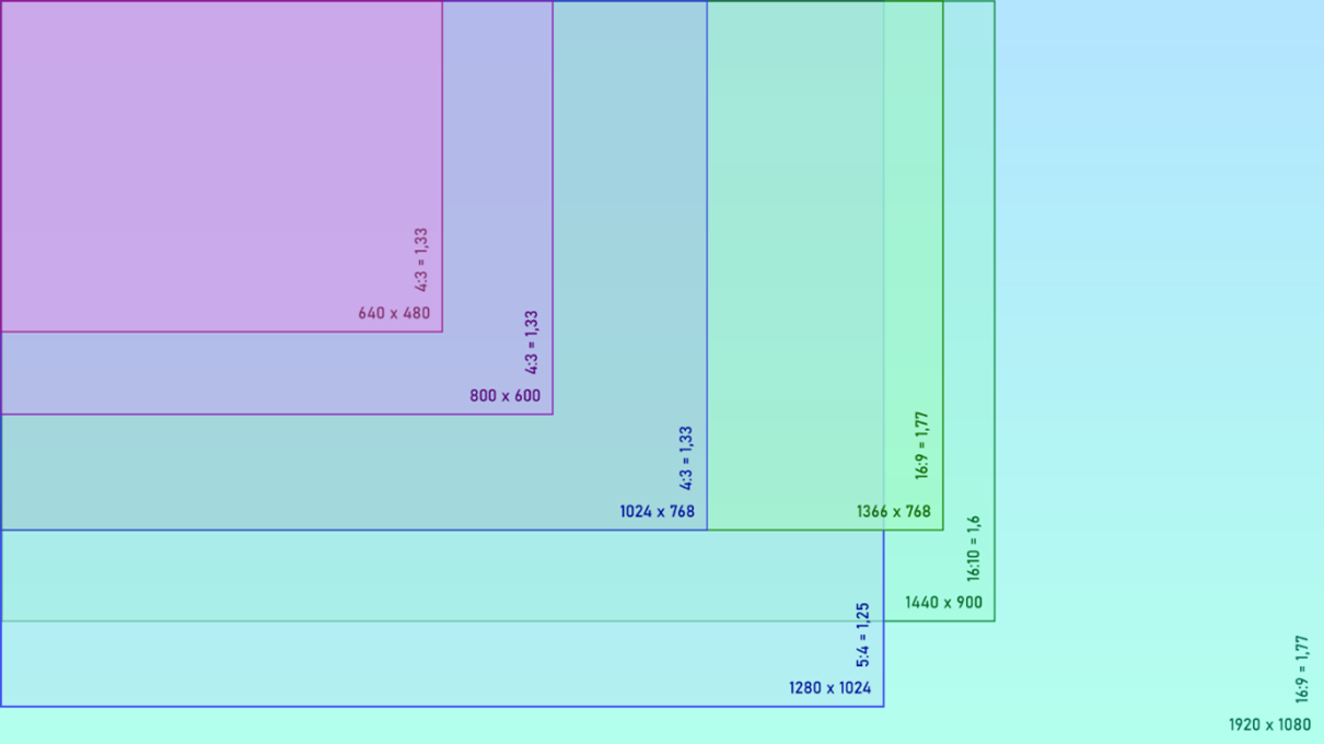
To do so, set up the figure above as your desktop background at your workstation.
If the template’s dimension are larger than the resolution supported by the monitor, set up the image to display “Side by side” by Windows. This will ensure the image is displayed with 100% accuracy on the main monitor.
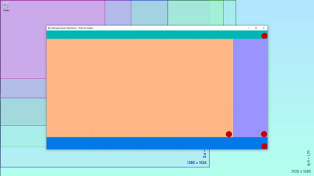
The idea is to place the Viewer’s window over the template, change its size to the desired result, and then assess the outcome:
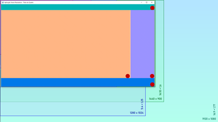
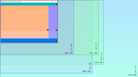
One of the upsides of using a template is the opportunity to assess how the application behaves with different aspect ratios and resolutions simultaneously. The template also helps understand how zoom and alignment parameters work with each other.
Frames and their visualization parameters
Our next step is to configure the frames in the application, their sizes, and the type of zoom to apply to each screen. The distribution below is the same we will use in this article’s demo application:
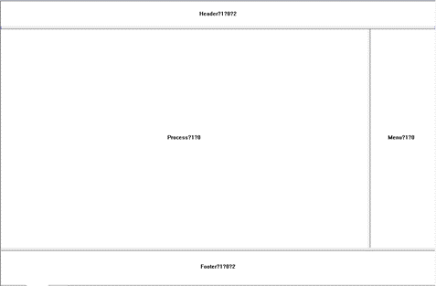
Each main splitter’s size will be configured via SplitValue property. You can configure the absolute values either in HIMETRIC or in pixels. This means the size of the frames won’t change when the Viewer window is rescaled.
We do, however, recommend using relative percentual values, which adjust the splitters as the Viewer window resizes. This will ensure the divisions always have the same proportion.
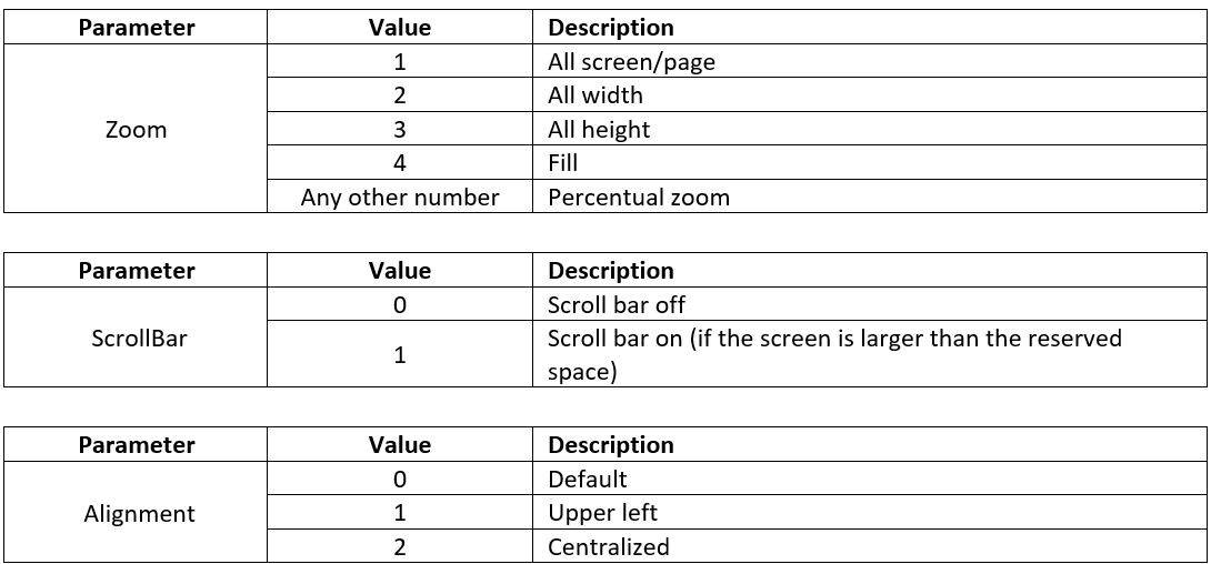
To configure the type of zoom, go to the string of the open screen command registered at each splitter’s SplitLink property. This command has the following format:
Screen?Zoom?ScrollBar?Alignment
We use question marks (?) to limit the properties. Possible values for each parameter are:
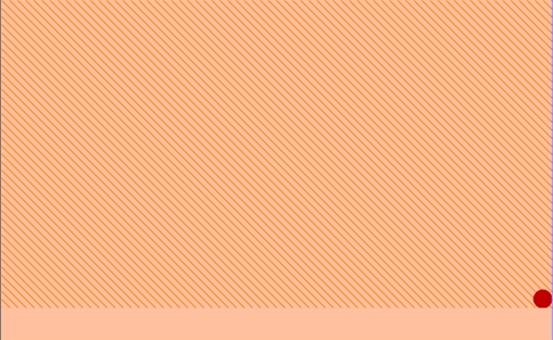
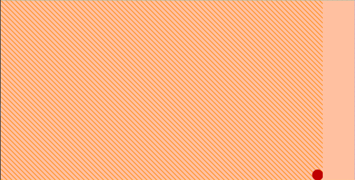
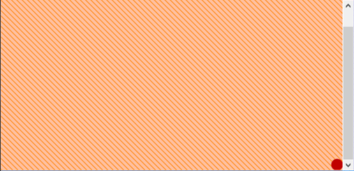
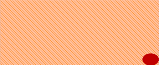
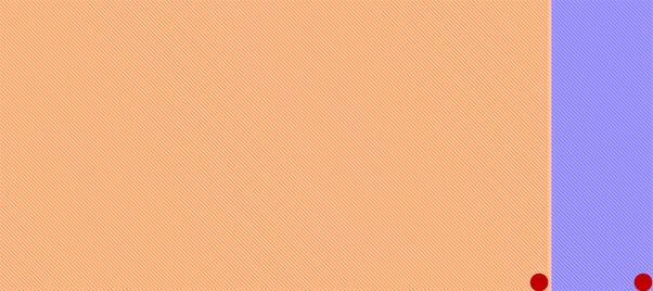
In the following examples, and in the demo application attached to this article, the screens’ usable area (that is, where objects are instantiated and displayed) is indicated by a pattern. On the other hand, the visible space exceeding this area is plain, and has no patterned effect on it:
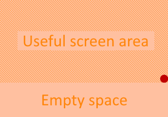
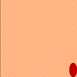
The red dot indicates the lower right limit of the usable area in each screen. It also indicates any distortions in the objects’ proportion, or if they’ve gotten bigger or smaller.
Types of Zoom
All screen zoom [1]
We recommend this type of zoom when you need a screen that is always visible, and whose objects show no distortion whatsoever.
Characteristics:
- Increases/decreases objects’ size with no distortion (maintains the original proportion).
- Never hides any part of the screen.
- Requires no scrollbars.
- May display an empty area near the screen.
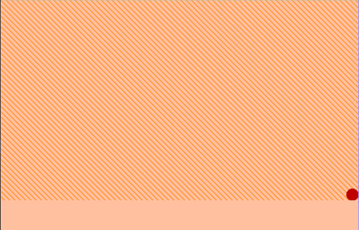
In the example below, the screen displays an empty area on its lower half, since the height of the visible area is larger than the height of the whole screen. Here, zoom value is 1 (All screen):
If the width of the visible area is larger than the width of the whole screen, the screen will display an empty area on its rightmost half:
All width zoom [2]
We recommend this type of zoom only when scrollbars are not undesirable, since this zoom will hide part of the screen if the visible area is smaller then its dimensions. Scrollbars are a functional resource, but they may impair visualization.
Characteristics:
- Increases/decreases objects’ size with no distortion (maintains the original proportion).
- May hide parts of the screen.
- May require scrollbars.
- May display an empty area near the screen.
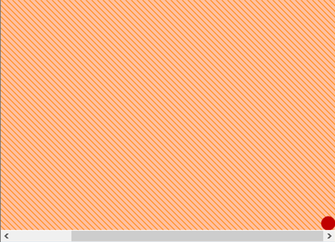
In the example below, the screen is only partially displayed, because the height of the visible area is shorter than the height of the screen. Here, zoom value is 2 (All width) and scroll value is 1 (Scrolling enabled):
If the height of the visible area is larger than the height of the screen, the scrollbar disappears; however, an empty area in the lower half of the screen appears:
All height zoom [3]
We recommend this type of zoom only when scrollbars are not undesirable, since this zoom will hide part of the screen if the visible area is smaller then its dimensions. Scrollbars are a functional resource, but they may impair visualization.
Characteristics:
- Increases/decreases objects’ size with no distortion (maintains the original proportion).
- May hide parts of the screen.
- May require scrollbars.
- May display an empty area near the screen.
In the example below, the screen is only partially displayed, because the width of the visible area is shorter than the width of the screen. Here, zoom value is 3 (All height) and scroll value is 1 (Scrolling enabled):
If the width of the visible area is larger than the width of the screen, the scrollbar disappears; however, an empty area in the rightmost half of the screen appears:

Fit zoom [4]
We recommend this type of zoom only when using objects whose content is not distorted if their dimensions change, such as E3Alarm, E3Chart, E3Browser, MSForms etc.
Characteristics:
- Distorts some objects when increasing/decreasing it dimensions (changes the original proportion).
- Never hides any part of the screen.
- Requires no scrollbars.
- Never displays an empty area near the screen.
In the example below, the screen’s width has been reduced, which leads to horizontal distortion. Here, zoom value is 4 (Fit):
In the example below, the screen’s hight has been reduced, which leads to vertical distortion. Here, zoom value is 4 (Fit):
Types of Alignment
Default alignment or Upper-left alignment [0] / [1]
We recommend either one of these types in most cases, because they allow the user to establish a fixed visual reference at the top and on the left of any frame as screen limit and content’s starting point.
Centralized alignment [2]
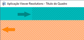
We recommend this type of alignment only for screens in strip format, which are very common for headers and footers. In such cases, if you use an All screen zoom [1], this alignment will create the illusion that the empty space is smaller than it actually is:
However, there is one situation when we don’t recommend centralized alignment: when zoom is enabled as [1] (All screen), and the Viewer window has been resized to measurements larger than the ones projected in the Studio. In this case, the content is displaced to the center of the screen (green arrow), thus increasing its margin and losing the alignment (orange arrow) with the content of the screen below.
Cutting down blank space
In this section, we will teach you a little “tweak” to minimize the blank spaces resulting from “All screen”, “All width” and “All height” types of zoom. To do so, we will reduce screen width at Studio in 5%-7%, but we’ll do so in a way that the user will hardly notice it.
Step 1: Adjusting to the Splitter
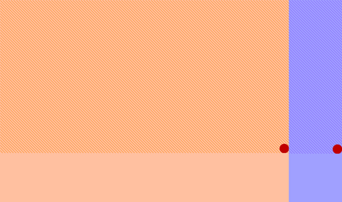
At Studio, in order to retrieve the dimensions recommended for the screens, right-click one of them and select Adjust to Splitter. Then, select the splitter corresponding to the screen, and apply it to the project. This configuration is the best possible size fit for the screens in Viewer default mode resolution, as seen below:
By selecting “All screen” zoom, when you run the Viewer and shrink the window’s width, a blank space is created on its lower half:
Step 2: Reducing Screen Width
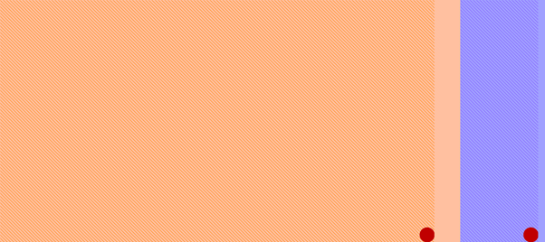
At this step, we will cut down this blank space a little. To do so, access Studio and set up each screen’s Width property for a value around 5%-7% smaller than the original. Then, execute the Viewer.
The first thing you’ll notice when running the Viewer is that these screens will display a little empty space to the right side:
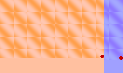
This empty space can be adjusted by the user by decreasing or increasing the reduction percentual applied to the screens. In this scenario, when you cut down the Viewer’s screen width, there is still a blank space on its lower half, but a little smaller than the one before:
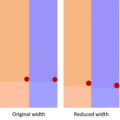
Compare the results in the figures below:
You can use the same procedure for the screen’s height, if necessary.
Text Adjustments
When you change the size of a window that displays text objects, such as DrawString, there might occur a difference between the text’s scale and the window’s, resulting in a small portion of the text being cut:


This happens because text font sizes occur in a gradient, in points (12, 10, 9, etc.). Therefore, the text object’s area may occasionally shrink more than the text itself, thus hiding part of the content with no reductions yet.
This is why it’s important to make sure each text object’s usable area is wide enough so that it won’t be cut when shrinking it.

By clicking and dragging the object’s handlers, you can augment its usable area:
That way, you will make sure the text won’t be cut down when the window’s dimensions are reduced.
Closing remarks
An application can have several types of scenarios, which use different types of resolutions and screen ratios. There is a great difference between adjusting a 1024 x 768 screen into a 800 x 600 one (same ratio, 4:3), and adjusting a 1920 x 1080 screen (16:9 ratio) into a 1280 x 1024 one (5:4 ratio).
Therefore, if the information in this article is not enough to reach a good scenario for your application, our suggestion is to create a group of screens for each ratio present in the project.
For computer monitors, the default ratios are 4:3, 5:4, 16:9 and 16:10:
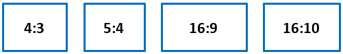
You can create two sets of screens, one for the 16:9 ratio and another one for the 4:3, which is a little more “boxy”. With both sets, you can also contemplate 5:4 screens (closer in look to 4:3 ones) and 16:10 screens (which will adjust better to the 16:9 set).
Thus, you can offer a solution for most monitor sets with no loss of clearness or readabilityof the original scenario.
Attachments:
