This application illustrates how data with bad quality (which might have been generated due to communication problems, for example) can be distinguished in a report. To do so, a script was created in the report to test the quality of the tag to be plotted.
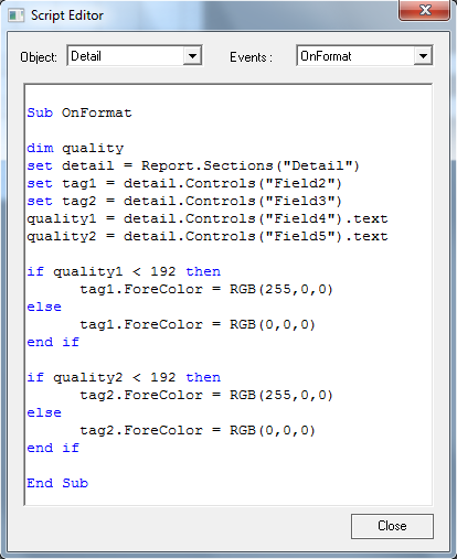
If the data has good quality, it will be printed in black; otherwise, it will be printed in red.
Attachments:
